 Fintech
Fintech Wordmark
We designed a custom wordmark with a distinctive letterform that doubles as a compact app icon.
- Custom-drawn wordmark
- Icon legible at 16 pixels
- Light and dark versions
Minimalist Logo Design
Simplicity is hard to design. A great minimalist logo distils your brand into its essential form — clean, confident and instantly recognisable. We craft minimal marks with precision so every line earns its place.
Minimal logos are everywhere — which is exactly why a generic one disappears. The challenge is to be simple and distinctive at the same time, with an idea strong enough to survive with very few elements.
We explore concepts deeply, then refine geometry, spacing and typography to a high standard. The result is a logo that feels effortless, looks sharp on any screen and won't date quickly.
Clean logos in every form.
Clean typographic logos with subtle custom details.
Simple shapes combined into a distinctive mark.
Single-weight line marks with elegant simplicity.
Minimal initials-based marks.
Clever marks that use empty space to add meaning.
Turning busy logos into cleaner, modern versions.
A selection of logo projects from our studio. Each began with a design brief and research, and ended with a mark built to work across every application.
FintechWe designed a custom wordmark with a distinctive letterform that doubles as a compact app icon.
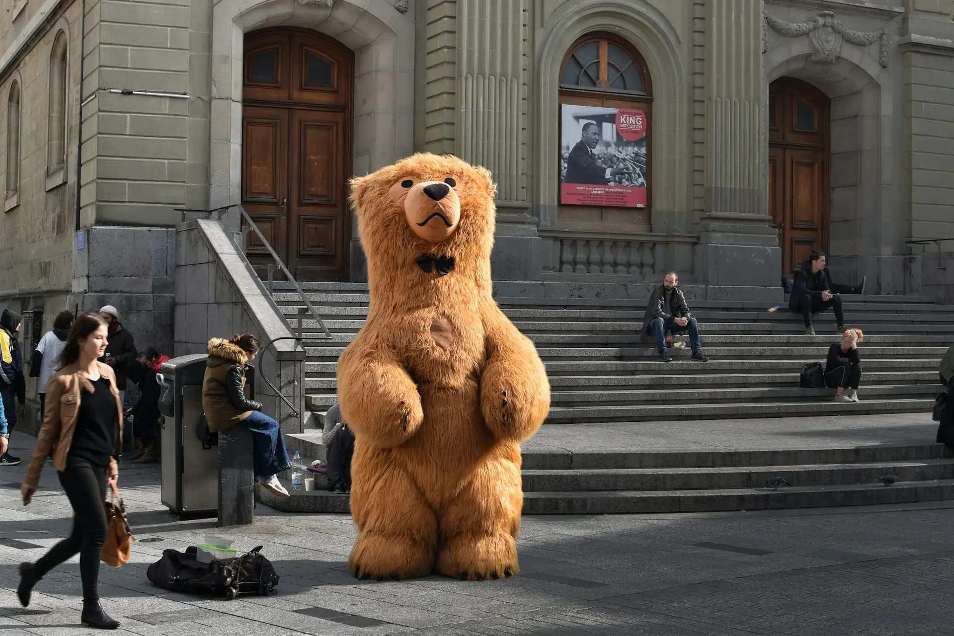 Hospitality
We created a playful mascot character with several poses for menus, cups and social media.
 Healthcare
We simplified and modernised the existing symbol, keeping its recognisable shape while improving legibility.
 SaaS
SaaSWe explored geometric concepts and delivered a distinctive symbol with a vibrant, ownable colour.
Three principles behind every minimalist logo.
Simplicity built on a meaningful concept.
A subtle twist that makes it yours.
Optical adjustments that make it feel perfect.
The craft behind clean logos.
We adjust shapes and spacing so the logo appears balanced to the eye.
In practice
A circular symbol was subtly enlarged to look the same size as its square neighbour.
Using empty space to reveal a second shape or idea.
In practice
A furniture brand's 'C' hides the silhouette of a chair in its counter.
Custom details in letterforms make minimal wordmarks ownable.
In practice
A fashion label's wordmark uses a shortened crossbar that becomes its signature.
Logos designed to work perfectly in black, white or a single colour.
In practice
A studio's mark is laser-engraved, embossed and printed with equal clarity.
Tell us about your brand. We'll share minimalist directions that fit — free.
Get Free Logo IdeasEvery sector has its own rules, audiences and pressure points. We shape each engagement around yours, so the work lands with the people it is meant for.
 Ecommerce & Retail
 Digital Healthcare
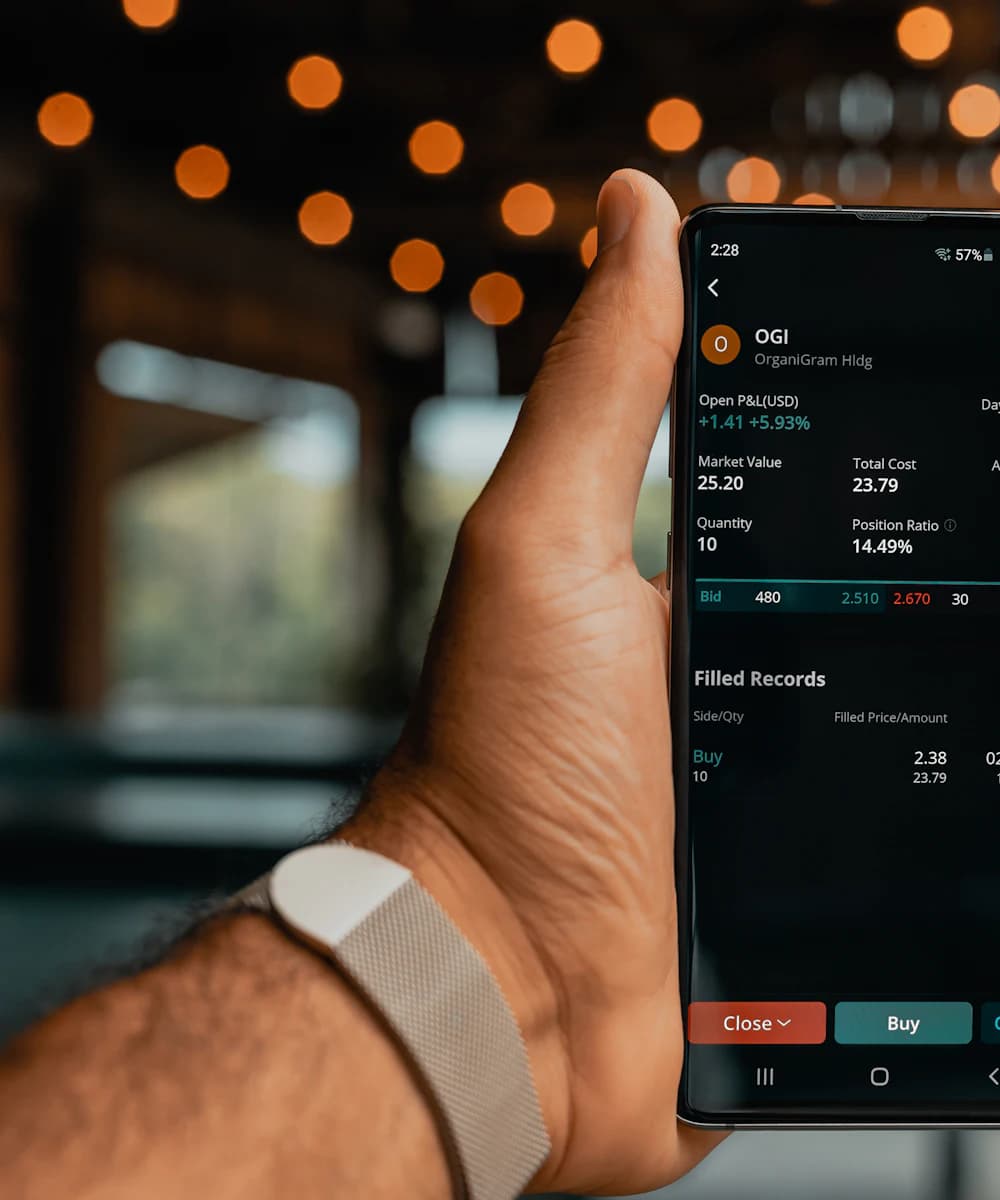 Fintech & Banking
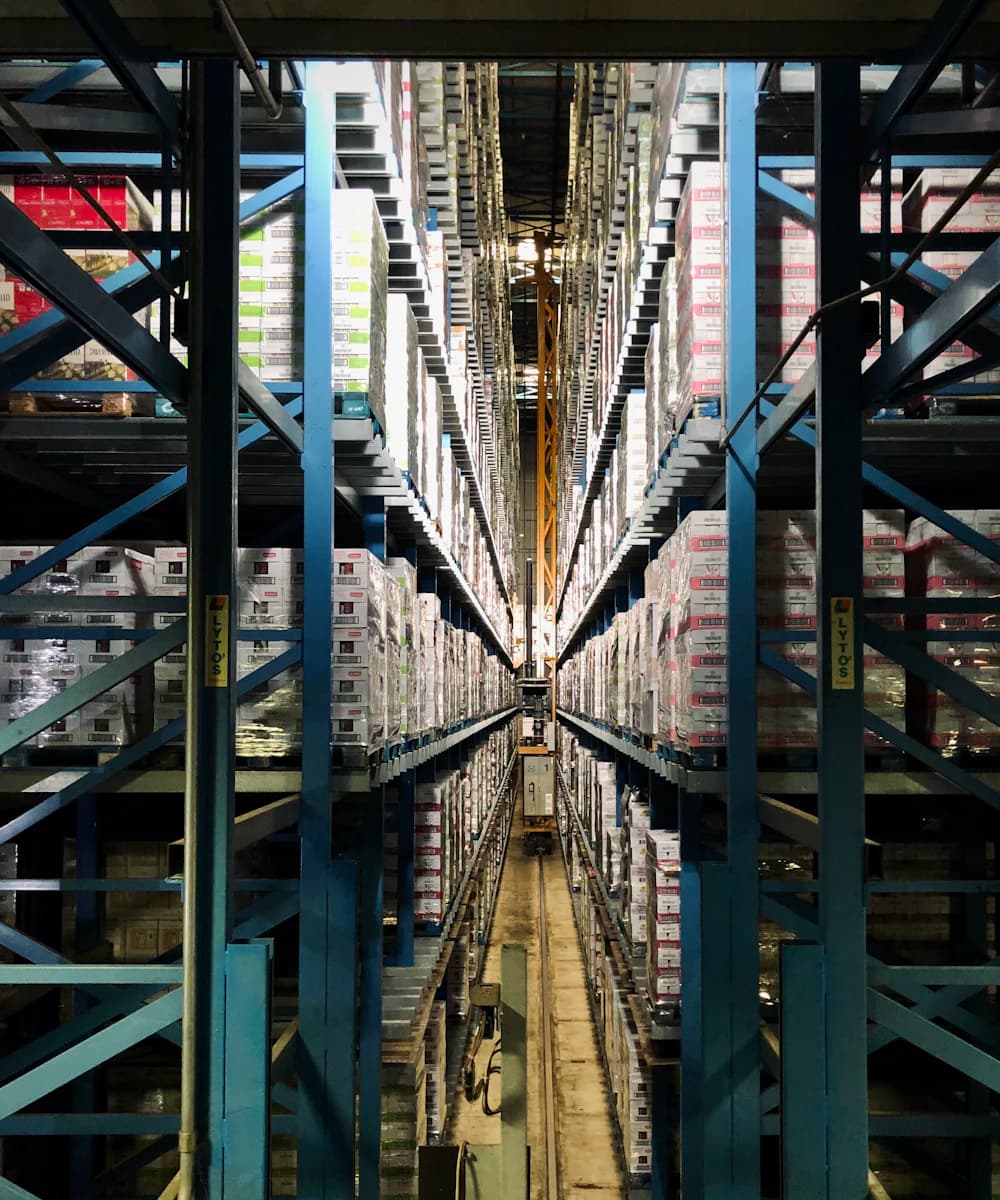 Delivery & Logistics
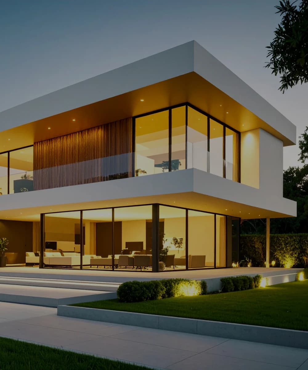 PropTech & Real Estate
 On-Demand Services
Minimal logos are versatile and long-lasting. They reproduce cleanly on any surface and size, reducing production issues and staying relevant as trends change.
A simple mark is also easier for customers to remember and recognise — the essence of an effective logo.

The minimalist logo work we deliver most often.
Clean marks for digital products.
Elegant, understated logos.
Precise, geometric marks.
Modernising busy logos.
Clean design communicates confidence.
A logo that won't date quickly.
Sharp from favicon to billboard.
Simple marks are easier to remember.
Restraint signals quality.
Works with any material or method.
Crisp on every screen.
Most projects draw on more than one discipline. These are the services that sit alongside this one.
A good minimalist logo is simple in form but rich in idea. Strong concepts and careful refinement make it distinctive rather than generic.
Yes, if it's built on a distinctive idea. We research competitors to ensure your logo doesn't blend into similar marks.
Yes. We can create a cleaner version of your current logo while keeping its recognisable elements.
They suit most industries, especially technology, fashion, design and professional services. We'll advise if another style would serve you better.
Most minimalist logos take 2–4 weeks, including concept exploration and refinement.
Vector and raster files in colour, black, white and single-colour versions, ready for print and digital.
Tell us about your project — whether it's a website, an app, SEO or marketing.